After years of ignoring the obvious, the Federal Reserve has been finally forced to admit that the labor force participation rate matters, and in fact has started to point it out as a clear negative when it comes to Yellen’s “dashboard” of thresholds which will allow the Fed to raise rates (for the obvious reason that the Fed is desperate to delay ZIRP as long as possible and is now highlighting all that is wrong with the economy, contrary to Obama who is still focusing on all the rigged greatness of the US recovery) and to do so is going through Zero Hedge archives to note all those things which everyone had ignored for years and which we have pointed out as structural failures of the so-called recovery.
So while we are happy to oblige the Fed with our tens of thousands of articles summarizing what is broken with the US economy thanks to, well, the Fed, here is another one: one which the Fed can use next year when the time to hike rates has come and gone, and when the Fed is once again scratching its head what to blame it on.
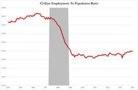
The chart below shows the civilian employment to population ratio: a convenient indicator of the real state of the US labor market which does away with the labor force entirely, and the associated rhetoric of why it may or may not be plunging, and merely focuses on two simple things: total population and the total civilian population of the US. One thing is clear: the ratio crashed when the depression started and has flatlined since. Which, incidentally, may be all you, and the Fed, needs to know about the recovery.
(Read the rest of the story here…)
