(Daniel J. Mitchell for The Daily Sheeple) Last week, I shared a graph showing there are more guns than people in the United States, and I wrote that it was the “most enjoyable” chart of the year, mostly because it gets my leftist friends so agitated.
But I’m more likely to share gloomy visuals, including:
- The “most depressing” chart about Denmark, which shows a majority of the population lives off the government.
- A “very depressing” chart about the United States, which shows how big business profits from cronyism.
- The “most depressing” chart about Japan, which shows the tax burden has nearly doubled since 1965.
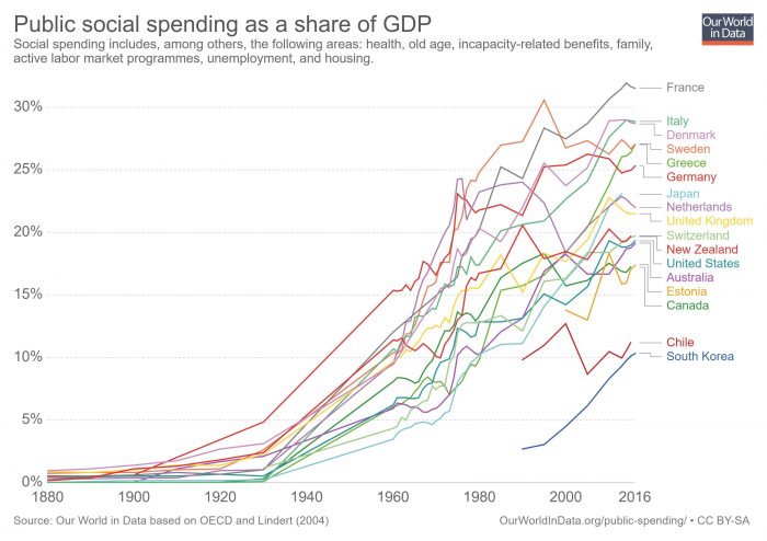
Now it’s time to add to that list. There’s a website called Our World in Data, which is a great resource if you’re a policy wonk who likes numbers. But some numbers are quite depressing.
For instance, if you peruse the “Public Spending” page, you’ll find a chart showing the dramatic expansion of redistribution spending as a share of economic output.
These numbers are very similar to the table I shared from Vito Tanzi back in 2013, which isn’t surprising since Professor Peter Lindert is the underlying source for both sets of data.
While the above chart is depressing to a libertarian, it’s nonetheless instructive because it confirms my argument that the Western world became rich when governments were very small and redistribution was tiny or even nonexistent.
For instance, nations in North America and Western Europe largely made the transition from agricultural poverty to middle-class prosperity during the “golden century” between the Napoleonic wars and World War I. That was a period when redistribution spending basically didn’t exist, and most nations didn’t even have income taxes (the U.S. didn’t make that mistake until 1913).
Even as recently as 1960, welfare states were very small compared to their current size. Indeed, redistribution spending in Western nations averaged only about 10 percent of economic output, about half the size of today’s supposedly miserly American welfare state.
These points are important because some folks on the left misinterpret Wagner’s Law and actually try to argue that bigger government is good for growth.
P.S. South Korea has been a great success story for the past five decades, but that redistribution trendline is very worrisome.
P.P.S. The trendline for Greece helps to explain why that nation is bankrupt.
P.P.P.S. The chart shows that Canada is better than the United States, though that may not last since Canada’s current prime minister is seeking to undermine his nation’s competitive advantage.
P.P.P.P.S. While fiscal trends in the Western world have been unfavorable, that bad news has been offset by positive trends for trade liberalization. Whether we will see a big step backward because of President Trump remains to be seen.
***
Daniel J. Mitchell is a Washington-based economist who specializes in fiscal policy, particularly tax reform, international tax competition, and the economic burden of government spending. He also serves on the editorial board of the Cayman Financial Review.